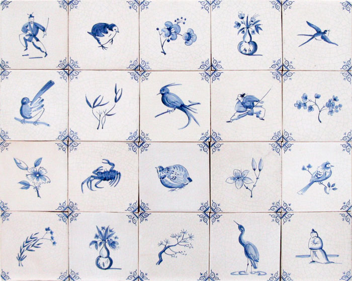
Delft Layout Inspiration
We know that when it comes to deciding how you want your tiles to be fixed on the wall, it can be difficult. Many of these layouts have been used by our clients in the past, for kitchens, bathrooms, or any other locations.

We are often asked ‘what should the layout of my tiles be?’, and the answer is often the same – it’s up to you!
When it comes to Delft tiles, or any other tile for that matter, personal preference is key. We can only advise the ways in which you can achieve a successful Delft layout, and it often comes down to which designs you like the best, whether you are featuring corner ornaments, and where the tiles are going. Many Delft layouts are eclectic, for example: you have a selection of smaller, larger and corner designs and they are placed together in a casual manner, with some designs placed next to one another, essentially not following a pattern. However we also come across Delft layouts that are just designs and corners, alternating over and over, creating a symmetrical look. The latter is preferred by myself and many others, people who are fond of patterns and want to pick their designs meticulously. The former is just as, if not more quaint, and by haphazardly placing the selections of designs anywhere they please, they create this fun and interesting panel of tiles.
We often take inspiration from Packwood House when discussing layout, with full landscape and figure designs in abundance, filing out to smaller birds, animals and trades designs. Our mixed white tiles are inspired by Rembrandt’s house in Amsterdam. With slightly differing shades, this creates a beautiful overall look.
